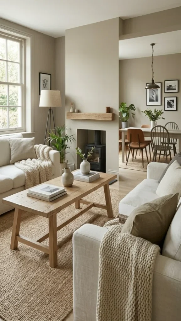
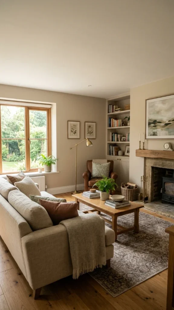
Top 22 Wall Colors for Living Room: Warm, Calm, and Stylish Ideas
Choosing the right color of wall can completely transform your living space. The perfect living room colors set the mood, highlight your furniture, and make your home feel welcoming and cozy.
From soft neutrals to warm earth tones, these paint colors for living room spaces balance style and comfort, giving you versatile interior color options that work in real homes.
Whether you’re refreshing a single room wall colors or planning a full makeover, these ideas help create a space you’ll enjoy every day.
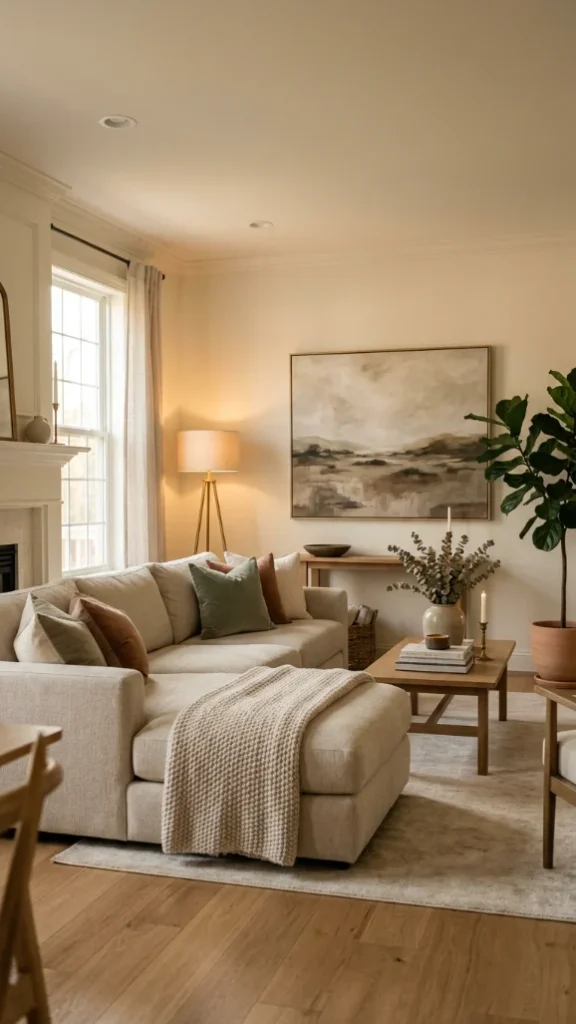
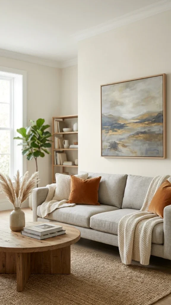
1. White Dove
A soft, warm white that brightens the space without feeling stark or cold. It’s one of those paint colors for living room spaces that feels clean yet inviting, making it ideal for both small and large areas.
The gentle undertone helps reflect light beautifully while still adding a hint of warmth. It works effortlessly with wood tones, neutral furniture, and layered textures, making it a dependable choice among living room colors that won’t go out of style.
Why it works:
- Keeps the room light and airy without harshness
- Pairs easily with any decor style
- A timeless room wall colors option
2. Ballet White
A creamy off-white with subtle warmth that softens the entire room without making it feel heavy. It sits perfectly between white and beige, making it one of the most versatile interior color options for everyday living.
The tone shifts slightly with lighting, appearing brighter during the day and cozier at night. It’s ideal for creating relaxed, comfortable living rooms colours that still feel polished and thoughtfully designed.
Why it works:
- Adds warmth while staying light
- Adapts beautifully to natural and artificial light
- Works well with soft textures and neutral decor
3. Swiss Coffee
A rich, creamy neutral that adds more depth than a typical white while still keeping the space feeling open. It’s a popular choice for paint colors for living room designs where a seamless, color-wrapped look is desired.
This shade creates a cozy yet refined atmosphere, especially when paired with warm lighting and layered decor. It brings a subtle elegance to living room colors without overpowering the rest of the design.
Why it works:
- Adds depth without going too dark
- Creates a cohesive, polished look
- Feels warm and inviting in any lighting
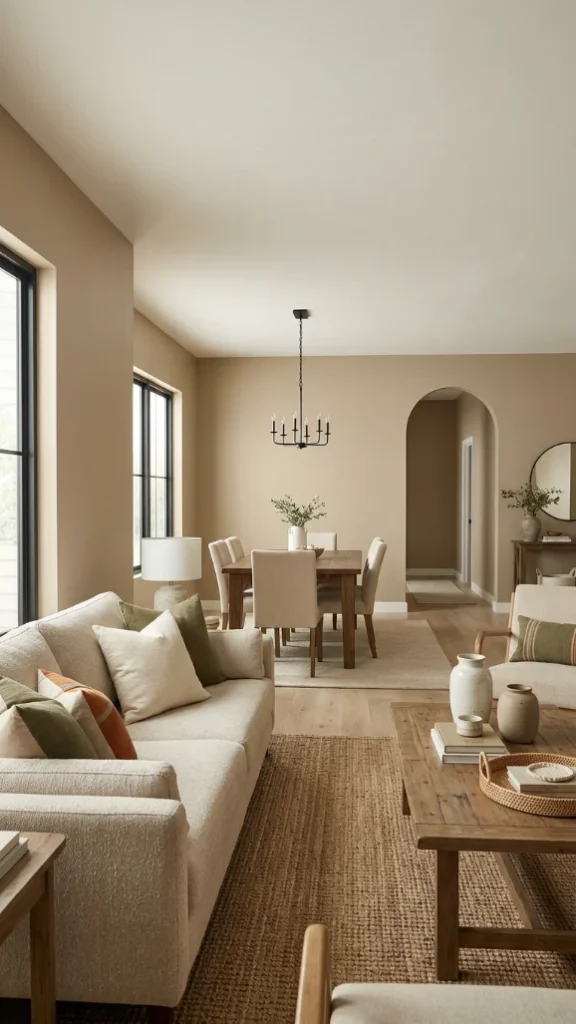
4. Universal Khaki
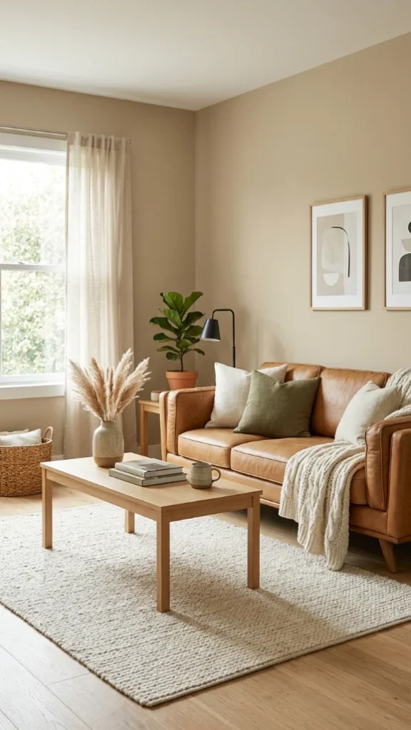
A grounded, sandy neutral that brings warmth and stability into your space without feeling too bold. This shade fits perfectly into modern living rooms colours that lean toward natural, earthy tones.
It pairs effortlessly with wood, leather, and organic textures, making styling simple and cohesive. If you’re looking for room wall colors that feel calm and lived-in while still being versatile, this is a strong and reliable choice.
Why it works:
- Creates a warm, welcoming atmosphere
- Complements natural materials beautifully
- Works in both bright and low-light rooms
5. Simple Stone
A warm greige with subtle sandy undertones that adds depth without overpowering the room. It’s one of those paint colors for living room spaces that feels current but won’t date quickly.
The balanced mix of beige and gray makes it adaptable to different styles, whether modern or traditional. It works especially well in open layouts where flow matters, making it a practical and stylish color of wall choice.
Why it works:
- Adds dimension while staying neutral
- Works in open layouts without clashing
- A safe upgrade from cool grays
6. Accessible Beige
A warm, balanced beige that feels comfortable without leaning too yellow or too gray. It’s one of the most dependable paint colors for living room spaces because it adapts easily to different lighting conditions and decor styles.
This shade creates a relaxed, lived-in atmosphere that works well for everyday life while still looking refined. If you’re transitioning away from cooler tones, this is a safe and stylish color of wall that feels updated yet familiar.
Why it works:
- Warm and inviting without feeling heavy
- Blends well with modern and traditional decor
- A classic choice among living room colors
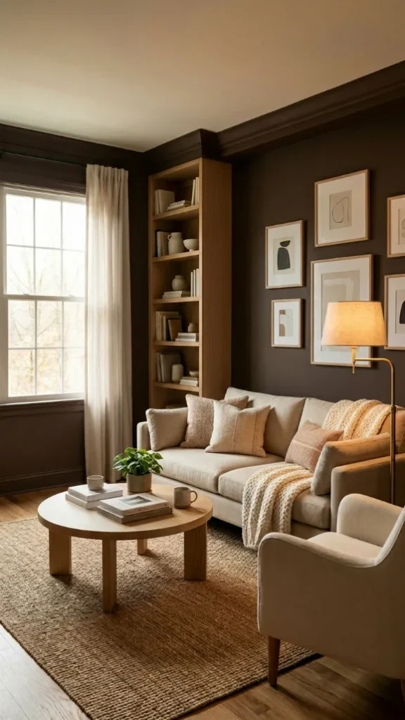
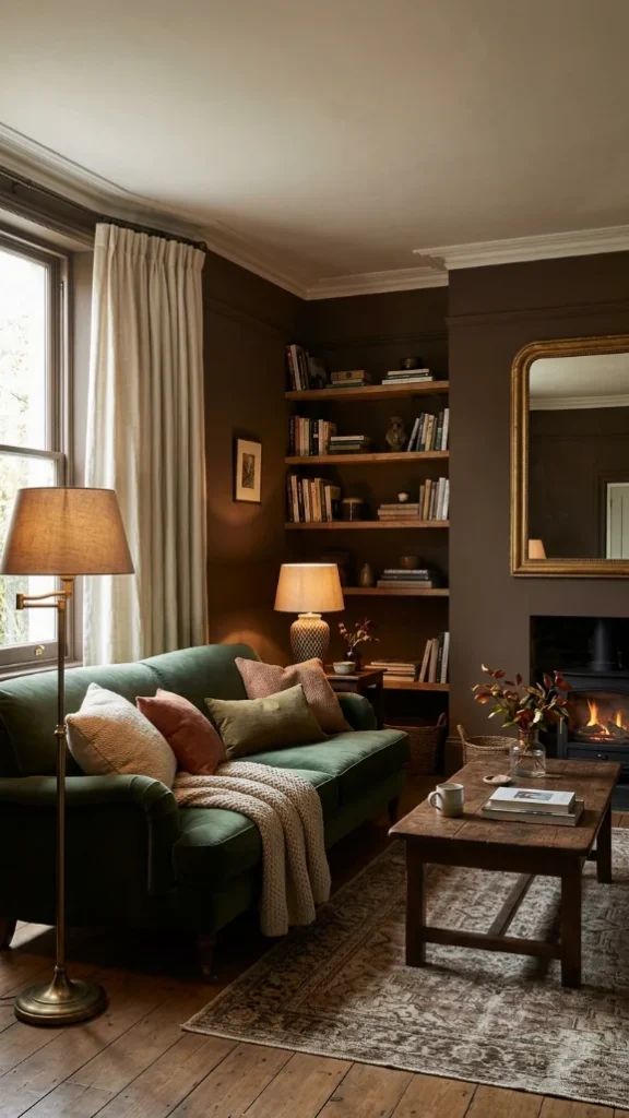
7. Silhouette
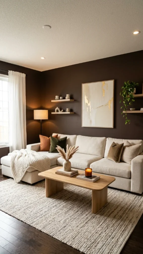
A deep espresso brown that brings richness and a sense of structure to the room. It’s a bold option within living rooms colours, but the warm undertone keeps it from feeling harsh or overwhelming.
This shade works best when balanced with lighter furniture, warm lighting, and layered textures. It creates a cozy, grounded environment that feels intentional and elevated, especially in larger living spaces or accent walls.
Why it works:
- Adds dramatic depth without feeling cold
- Anchors the room visually
- Ideal for creating a cozy, intimate setting
8. Iron Ore
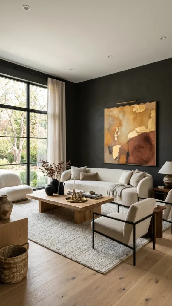
A deep charcoal that delivers a modern, refined look while still feeling livable. It’s one of those room wall colors that adds contrast and definition without going fully black.
The subtle warmth in the undertone helps it pair well with wood finishes, metals, and soft textiles. This shade works particularly well as an accent wall or in rooms with good natural light, making it a bold yet balanced interior color options choice.
Why it works:
- Creates strong visual contrast
- Feels modern but not too harsh
- Works beautifully with lighter accents
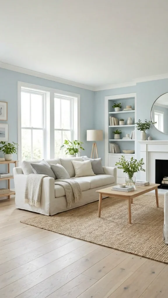
9. Blue Gray
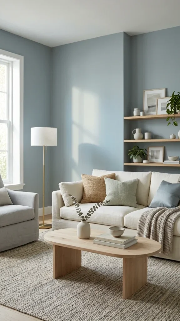
A soft, muted blue-gray that brings a calm and relaxed feeling into the space. It’s one of those paint colors for living room areas that feels peaceful without becoming dull.
The tone shifts subtly depending on the light, sometimes appearing more blue and other times more gray, which adds depth. It’s a great option for creating soothing living room colors that still feel thoughtful and slightly elevated.
Why it works:
- Promotes a calm, comfortable atmosphere
- Changes beautifully with lighting
- Pairs well with whites and natural textures
10. Harbor Haze Blue
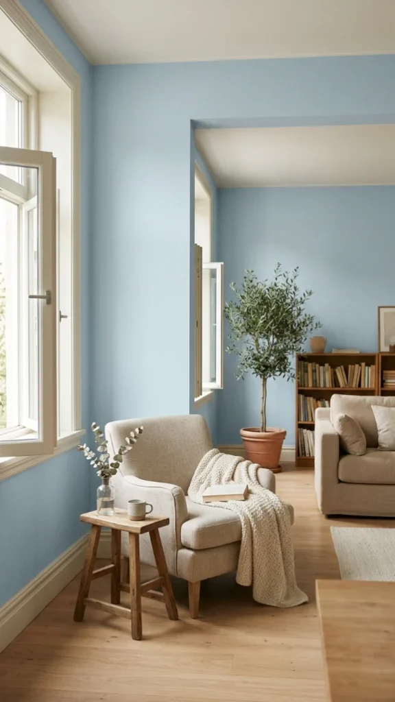
A gentle, desaturated blue that feels light, airy, and easy to live with. It adds a touch of color without overwhelming the space, making it ideal for relaxed living rooms colours.
This shade works especially well in rooms with natural light, where it creates a soft, open feel. If you want a subtle shift from neutrals while keeping things calm, this color of wall is a great way to introduce color.
Why it works:
- Light and uplifting without being too bold
- Enhances natural light beautifully
- A soft alternative to traditional neutrals
11. Oyster White
A warm off-white with subtle beige and gray undertones that give it a soft, sunlit feel. It’s one of those paint colors for living room spaces that looks especially beautiful in natural light, creating a gentle glow throughout the day.
This shade avoids looking flat by adding just enough depth, making it a practical choice for everyday living. If you want living room colors that feel bright but still cozy, this is a reliable and easy option.
Why it works:
- Captures light with a soft, warm glow
- Adds depth without overpowering
- A versatile room wall colors choice
12. Green Smoke
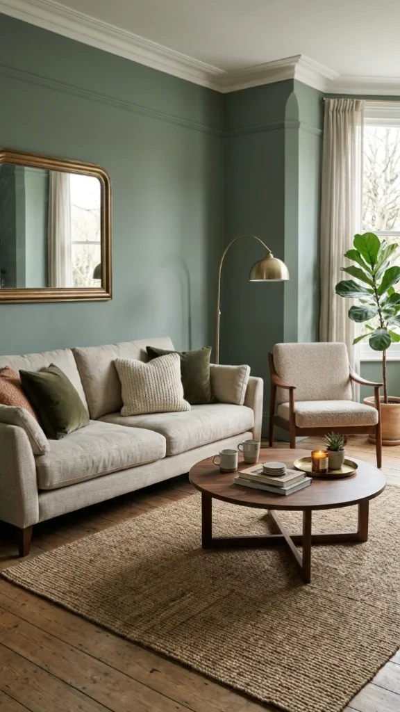
A muted green with a slightly smoky undertone that feels both classic and modern. It brings a natural, grounded vibe into the space, making it perfect for calm and layered living rooms colours.
This shade works beautifully with wood, brass, and neutral fabrics, creating a balanced and inviting atmosphere. It’s a great color of wall if you want something richer than beige but still easy to style.
Why it works:
- Adds a natural, calming feel
- Works well with earthy textures
- Feels timeless yet current
13. Aristocrat Peach
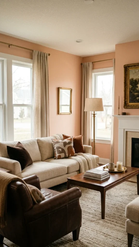
A soft, muted peach that adds warmth and personality without feeling overly sweet. It’s one of those interior color options that brings a subtle glow to the room, especially in softer lighting.
This shade works well in spaces where you want a welcoming and slightly unique feel while staying livable. It pairs nicely with creams, browns, and gold accents, making it a standout among living room colors.
Why it works:
- Adds warmth with a hint of color
- Creates a welcoming, relaxed vibe
- Pairs beautifully with warm accents
14. Setting Plaster
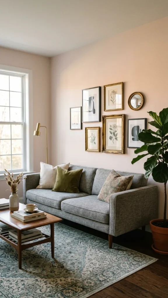
A pale pink with peach undertones that shifts gently depending on the light, sometimes appearing neutral and sometimes softly warm.
It’s a refined choice for paint colors for living room spaces that need a bit of personality without going bold. This shade works well with both modern and vintage decor, adding depth in a subtle way.
It’s a unique yet approachable room wall colors option.
Why it works:
- Adds soft color without overpowering
- Changes tone beautifully throughout the day
- Works with a wide range of decor styles
15. Shadow Beige
A warm, earthy beige that creates a grounded and cohesive feel in the room. It’s ideal for open layouts where you want consistent living rooms colours flowing from one space to another.
This shade has enough depth to avoid looking flat while still acting as a neutral backdrop for furniture and decor. If you prefer classic interior color options that feel stable and easy to live with, this is a dependable choice.
Why it works:
- Grounds the space with warm undertones
- Works well in open-concept layouts
- Easy to pair with different styles and textures
16. Walnut Brown
A rich, warm brown that adds depth and a sense of comfort without feeling too heavy. It’s a strong choice for paint colors for living room spaces where you want a cozy, grounded atmosphere.
This shade works especially well with lighter furniture, warm lighting, and natural materials, creating a balanced contrast.
If you’re leaning toward deeper living room colors but still want something inviting, this tone brings both warmth and sophistication.
Why it works:
- Adds richness without feeling overwhelming
- Creates a cozy, intimate setting
- Pairs beautifully with light and natural textures
17. Dalila / Ochre
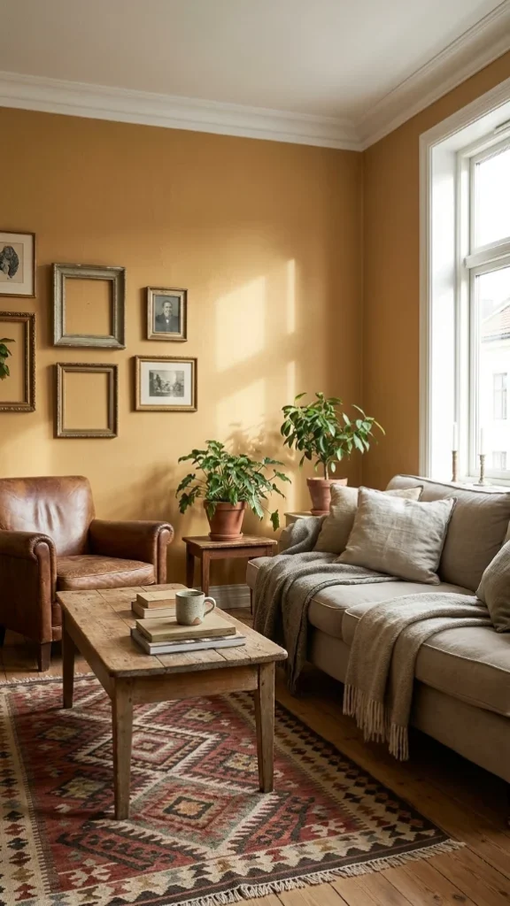
A warm, sunbaked ochre that brings energy and character into the room while still feeling earthy and lived-in. It’s one of those living rooms colours that adds personality without becoming too bold or distracting.
This shade works well with wood finishes, vintage pieces, and layered textiles, giving the space a collected feel. As a color of wall, it’s perfect if you want something warmer than beige but more subtle than bright yellow.
Why it works:
- Adds warmth with a hint of vibrancy
- Feels grounded and natural
- Works well with eclectic or layered decor
18. Misty Blue
A soft, airy blue that creates a light and calming atmosphere without feeling cold. It’s a great option among paint colors for living room spaces if you want to open up the room visually while adding a gentle touch of color.
This shade pairs well with whites, light woods, and soft fabrics, making it easy to style. It brings a fresh feel to living room colors without overpowering the space.
Why it works:
- Makes the room feel open and relaxed
- Adds subtle color without heaviness
- Works well with light, neutral decor
19. Tanner’s Brown / Earthy Umber
A deep, muddy brown that creates a strong, enveloping feel in the space. It’s one of those room wall colors that adds weight and character, especially in larger living rooms or statement walls.
The warm undertone keeps it from feeling too dark, while the richness adds depth and interest. This shade is a bold yet grounded interior color options choice for those who want a cozy, dramatic look.
Why it works:
- Anchors the room with depth and warmth
- Creates a bold, cozy atmosphere
- Works well with layered lighting
20. Pistachio-Chartreuse
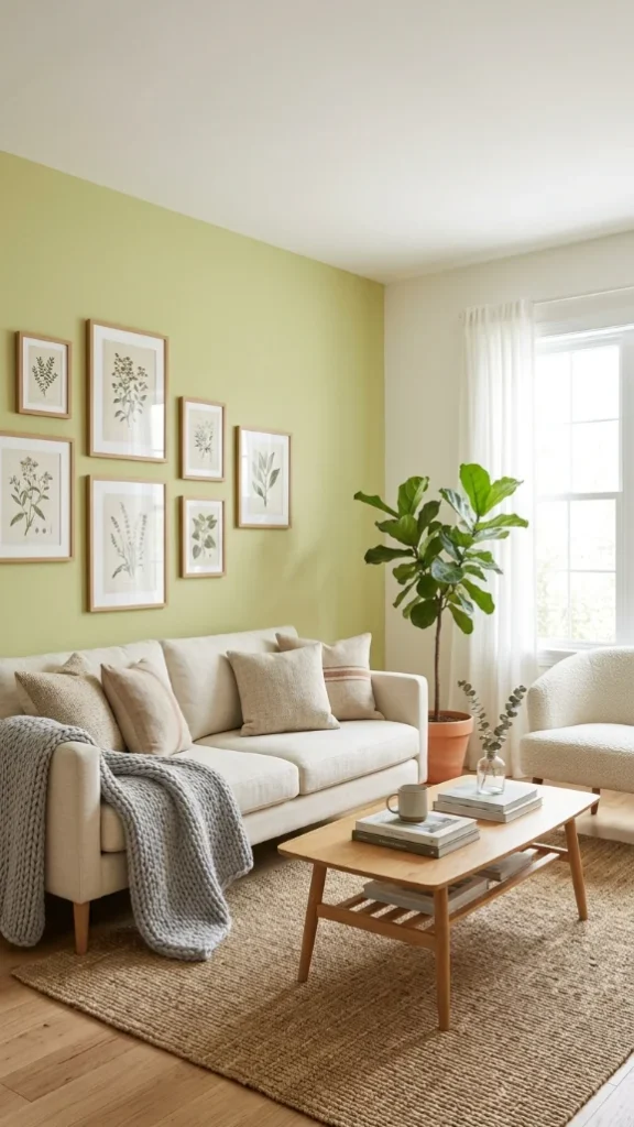
A muted green with a hint of yellow that brings a fresh, natural energy into the space. It’s a unique pick among living rooms colours, offering something more playful while still feeling grounded.
This shade works well as an accent wall or in rooms with plenty of natural light, where its tone feels lively but balanced. As a color of wall, it’s ideal if you want to introduce color without going too bold.
Why it works:
- Adds a fresh, uplifting feel
- Brings subtle personality into the room
- Pairs well with wood and neutral tones
21. Clay / Terra Cotta Warm Earth Tones
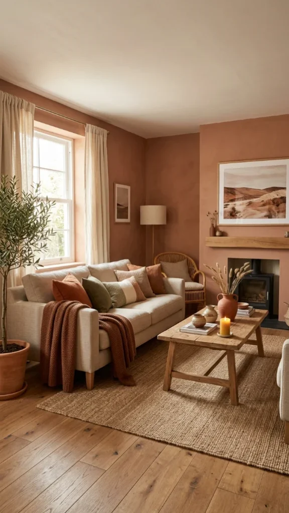
A warm clay-inspired shade that brings an earthy, sunbaked feel into the room. These tones sit somewhere between soft brown, muted orange, and dusty terracotta, making them one of the most inviting living room colors right now.
They create a cozy, grounded atmosphere that works especially well with natural wood, woven textures, and linen fabrics. If you want paint colors for living room spaces that feel warm and full of character, this is an easy way to make the room feel more personal.
Why it works:
- Creates a warm, welcoming atmosphere
- Adds earthy depth without feeling too dark
- Pairs beautifully with natural materials and textures
22. Powder Blue / Azure Tide
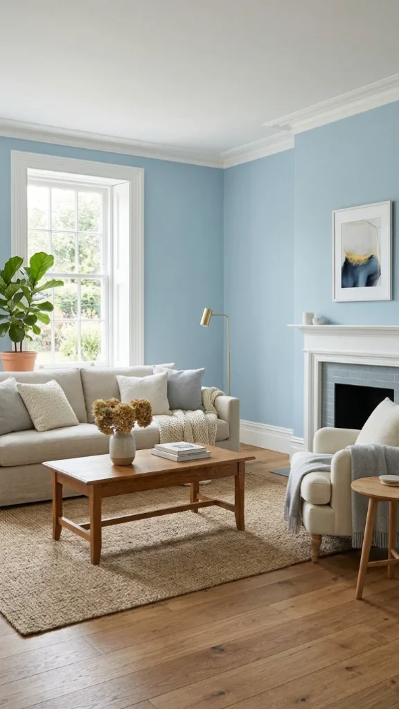
A soft powder blue with a subtle richness that keeps it from feeling too pastel. It brings a calm, airy quality into the room while still adding enough color to make the walls feel intentional.
Among softer room wall colors, this shade works especially well with white trim, warm woods, and neutral furniture. It’s one of those interior color options that feels soothing during the day and cozy in the evening.
Why it works:
- Adds calm color without overwhelming the space
- Makes the room feel lighter and more open
- Works well with both modern and classic decor styles